Kim & Jake’s Logo and Package Refresh
About This Project
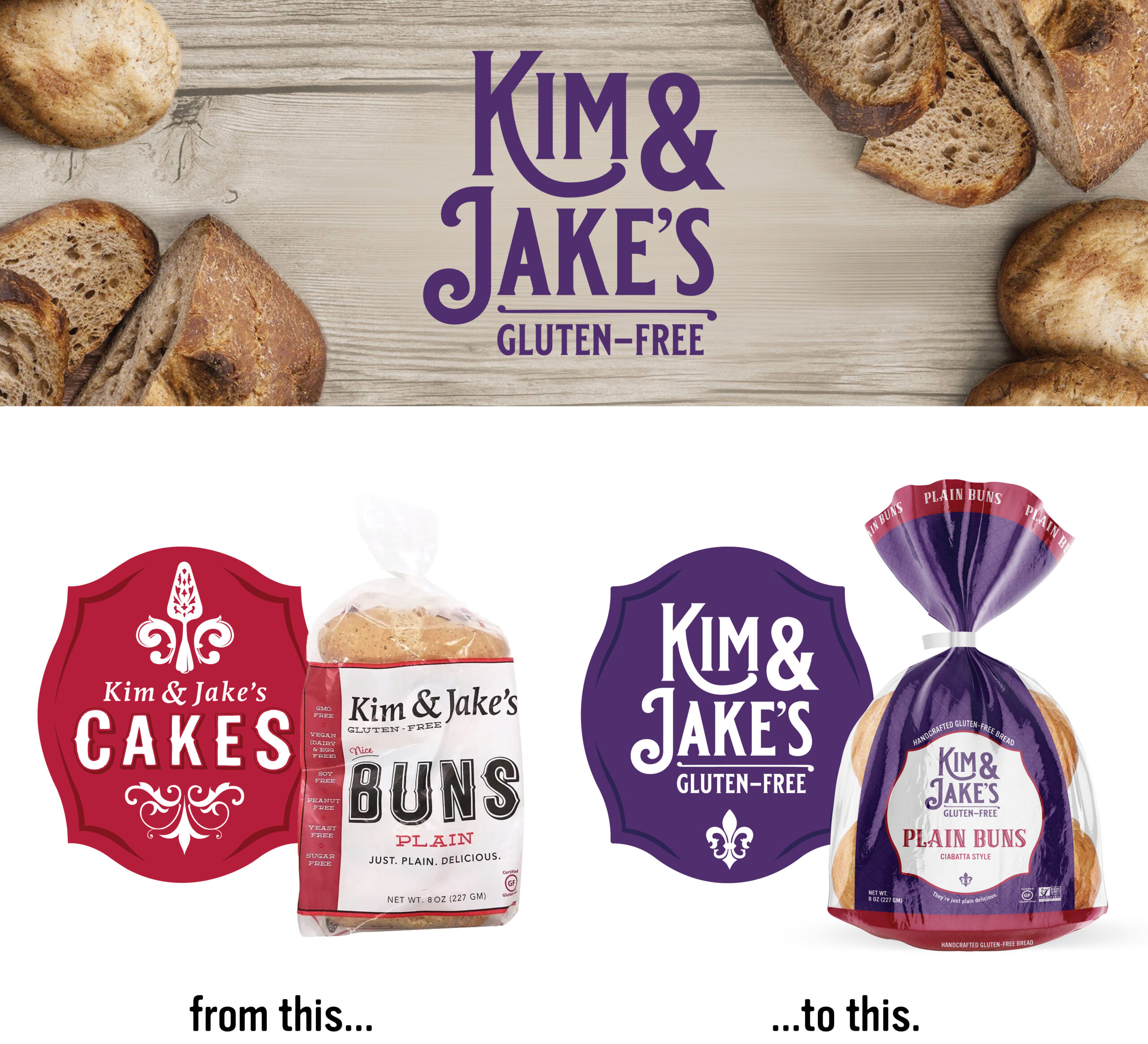
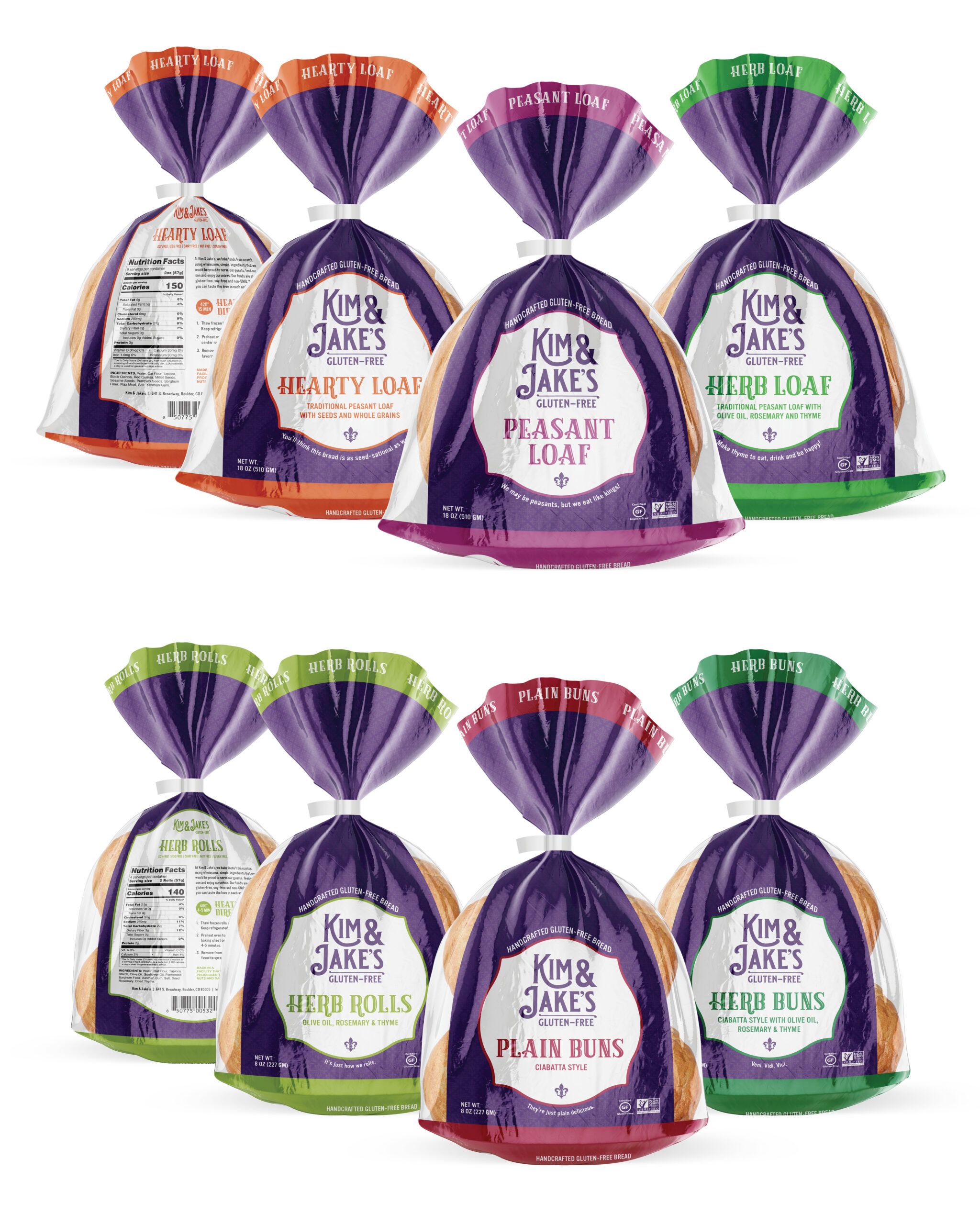
When Kim & Jake’s was expanding their business they needed to refresh their logo and package designs. They wanted to keep the badge shape from the original logo but bring in more of a New Orleans feel, paying homage to Kim’s hometown. Changing the brand color to a deep purple achieved this, as well as providing a more neutral backdrop to the individual variety colors. Since the brand was no longer focusing on just cakes, the fleur-de-lis made out of a pie server in the orginal logo was simplified and reduced in size. It was also used as a subtle pattern on the package background.

